Halden is a brand and design studio in Oslo and London. We work with founders and in-house teams on identities that survive contact with the real world: a logo that still reads at 16 pixels, a type scale that holds up across forty templates, a voice a sales team can actually use. This guide walks through how we work, what we hand over, and the standards we hold ourselves to.
How we build brands that hold.
Words by the Halden team · March 2026
01 · The studio
Eleven people, two cities, one set of standards
Halden opened in 2012 with two people and a single client, a furniture maker who needed a catalogue. We are eleven now, split between Oslo and London, and the work has changed shape, but the way we run a project has not. Small teams. One person accountable. Everything made in-house by the people who presented it.
14
Years in practice
Long enough to have watched our early work age. Two of the identities we made in 2014 are still running without a refresh.
06
Disciplines in-house
Strategy, identity, type design, digital, motion and editorial. We do not subcontract the parts that decide how the work feels.
02
Studios
Oslo and London, on one shared calendar. Whoever is closest to your office runs the meetings.
02 · How we work
Five steps, and you always know which one we are on
Every project runs the same five steps, whether it is a six-week identity or a year of retained work. The names are boring on purpose. Step through them below.
What this looks like in a calendar
A typical identity project is ten to fourteen weeks. Listen takes two, Frame takes two, Make takes four to six, Prove takes two, and Hand over takes one. We book the review dates before we start, so nothing waits on finding a slot.
You get a named lead and a second designer, and both are in every review. There is no account layer between you and the people doing the work, and no deck summarising a conversation you were already in.
If a step is going to overrun, you hear it on the Monday it becomes likely, not at the review where the work was due.
01
Listen. Two weeks of interviews with your team, your customers and, where it helps, the people who chose someone else. We read what you already have before we ask for anything new.
03 · What we make
Six disciplines, and the thing we actually hand you
Most studios list services. This is a list of outputs: the files, the fonts and the written rules that leave our server and land on yours. If a discipline is not on it, we will say so and recommend someone who does it properly.
The index
Brand strategy
One page that says what the brand is for and what it will not do. Interviews, a positioning line, and the argument behind it.
Identity
Wordmark, symbol where one is earned, colour, a type scale, layout rules, and the grid everything sits on.
Type design
Custom and modified faces, drawn in-house. Usually a display cut and a tightened text weight, licensed to you outright.
Digital product
Marketing sites and app surfaces, built as components your engineers can take over. We write the handoff notes ourselves.
Motion
How the identity behaves: logo builds, transitions, a timing and easing register the team can reuse without us.
Editorial
Reports, books and campaign writing. Usually the fastest way to find out whether a voice actually holds up.
04 · A rebrand, start to finish
Nordvik Press, from one typeface to forty templates
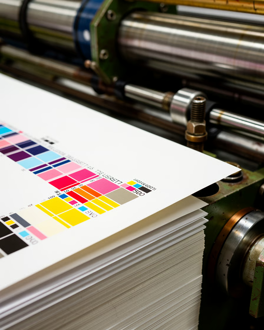
Nordvik came to us with a catalogue problem. Four designers were setting books in four different ways, and the imprint had started to look like four publishers. The brief was not a new logo. It was a system two freelancers could use on a Friday afternoon without calling anyone.
We spent the first fortnight reading their back catalogue and found the thing worth keeping: a 1974 cover series set in a narrow serif nobody had used since. We redrew it as a two-weight family, built a nine-column grid around the trim sizes they actually print, and threw out the rest.
The handover was forty templates, a type specimen and one afternoon of training. Eighteen months on, Nordvik has published ninety-one titles on it and has not asked us to change a thing. The system is doing the work, which is the only measure we care about.
05 · Systems, not logos
A logo is the easy part. The system is the job.
What we actually hand over is a set of decisions somebody else can apply without us in the room. Four things carry most of the weight.
Grids
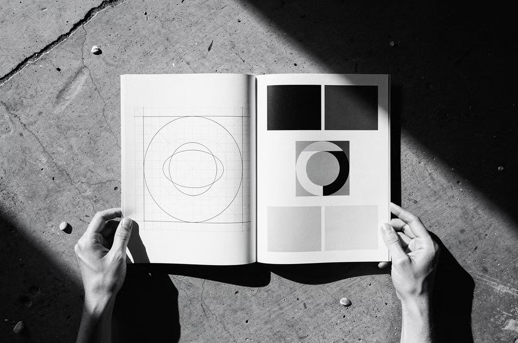
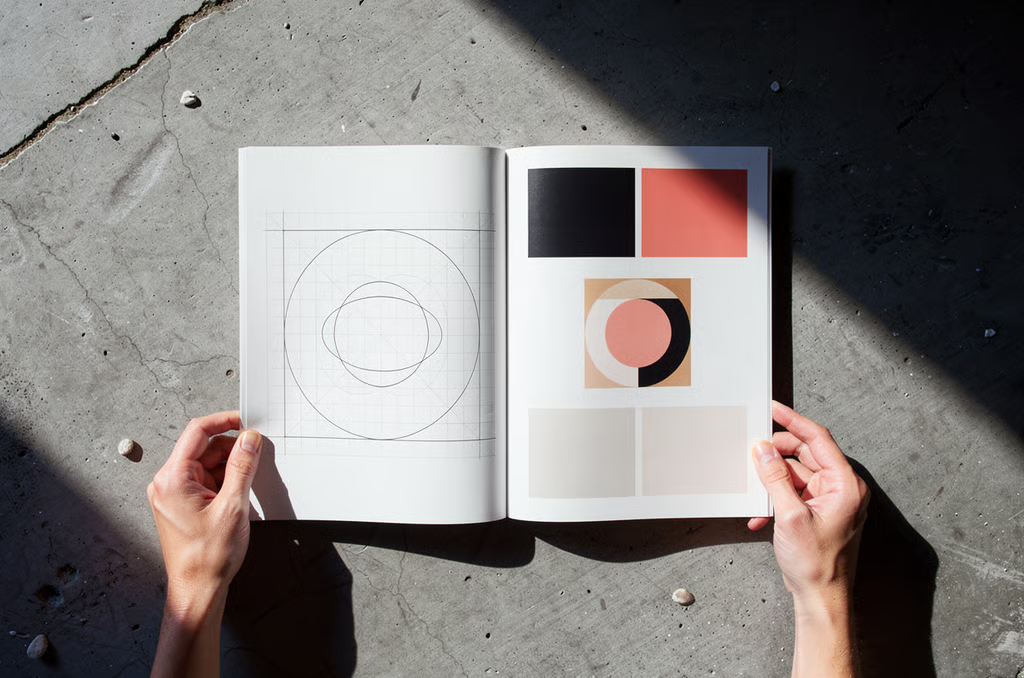
One spacing scale and one column structure across print and screen, chosen from the formats you actually produce. Nine columns for a catalogue, twelve for a site, and the same baseline underneath both.
Type scales
Six sizes, not twenty, each with a line height and a job. We test the smallest one on the worst screen in your building before we sign it off.
Motion
Two durations and two easings, documented with the reason for each. Enough for a team to animate consistently without inventing a new register per project.
Voice
Not adjectives. Twenty before-and-after rewrites from your own copy, so the rule is visible rather than described. Sales decks improve first, every time.
06 · Standards
Three things we will not negotiate
Studios usually keep these internal. We put them in the proposal, because they are the parts clients find out about late and are the most expensive to discover then.
Craft
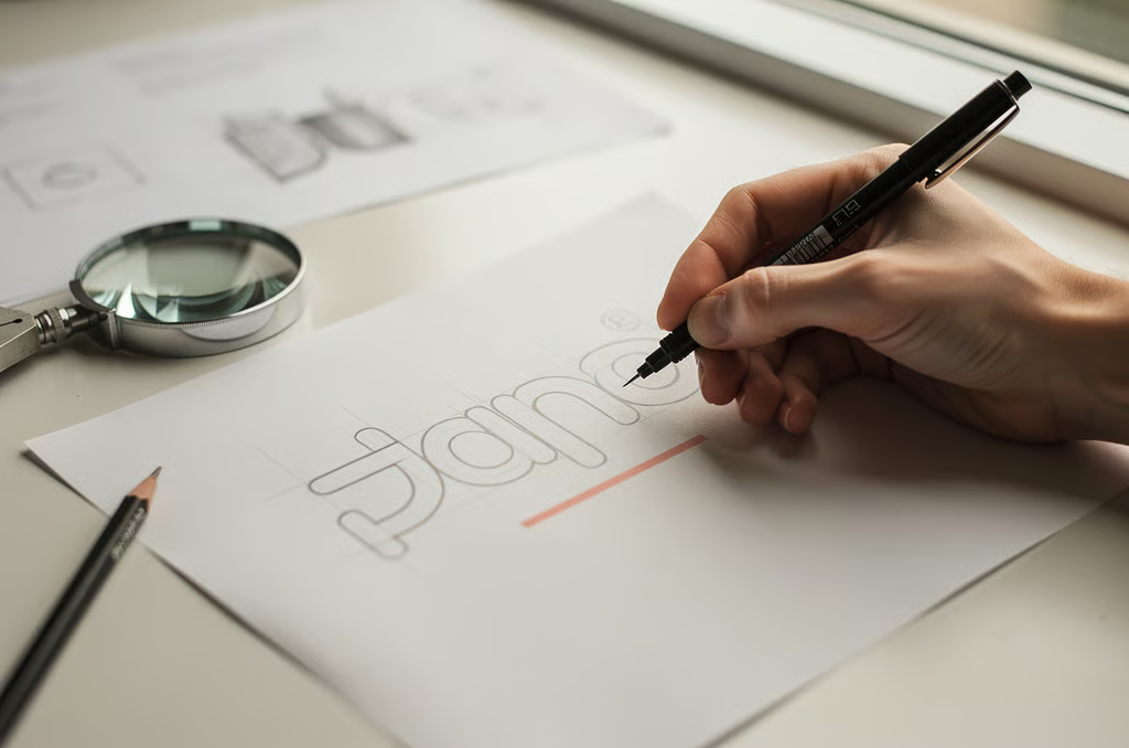
Nothing leaves the studio at a size we have not tested. Wordmarks get drawn at 16 pixels and at two metres. If it only works in the presentation, it is not finished.
Critique

Every project is pinned up to the whole studio twice before you see it. The person who made it does not present it, which is the fastest way to find out whether the idea stands on its own.
Documentation
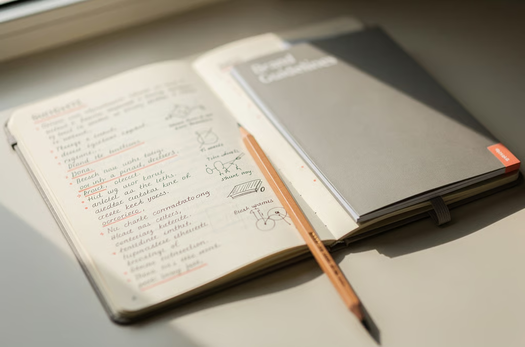
Written while the work is made, not after. If a rule cannot be explained in two sentences to someone who was not in the room, we have not understood it yet.
07 · Working with us
Five ways a project usually starts
Pick the one closest to your situation. The figures are the range we have actually charged over the last two years, not a starting-from number.
Brand
Digital
Editorial
Motion
Retainer
Brand · 10 to 14 weeks
A full identity: strategy, wordmark, type, colour, applications and a written system. Two of our team on it throughout, with your founders in every review. This is most of what we do.