SUPERBLOOM / INDEPENDENT CREATIVE STUDIO / LISBON
Scroll. The page changes hands.
Superbloom is a creative studio in Lisbon. This portfolio is built the way we work: every project takes over the page it sits on, so what you read is four brands rather than one house template.
VOLT ATHLETIC • BRAND SYSTEMS • NORTHBANK • CAMPAIGN • MARROW & CO • PACKAGING • OSSA • ART DIRECTION •
VOLT ATHLETIC • BRAND SYSTEMS • NORTHBANK • CAMPAIGN • MARROW & CO • PACKAGING • OSSA • ART DIRECTION •
HOW TO READ THIS PAGE
Four projects. Four takeovers.
01 / THE SHELL
Paper, ink and one blue. This is the studio speaking in its own voice, and you are in it right now.
02 / THE TAKEOVERS
Scroll into a project and the colour, the scale and the grid all change to match that client. The bones underneath stay exactly where they were.
03 / THE RETURN
After the fourth project the shell comes back, quieter than you left it.
PROJECT 01 / VOLT ATHLETIC
BRAND SYSTEM, KIT GRAPHICS, RETAIL / 2024
Made to be seen from the back row
Volt arrived with strong product and a very quiet identity. We built a system loud enough to survive a stadium: one orange, one warning yellow, and type set at the size of a scoreboard. The kit graphics were drawn to read at forty metres and at four.
THE PROBLEM
The identity disappeared next to the competition, on shelf and on screen.
THE MOVE
One dominant orange, one warning yellow, and every word locked to a single condensed weight.
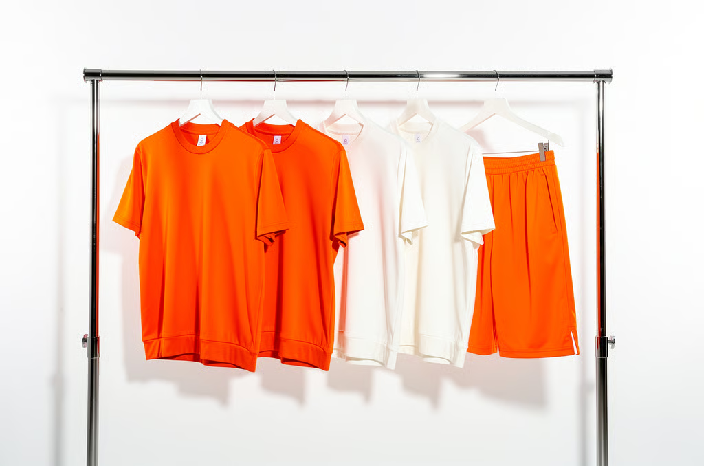
CAMPAIGN RAIL
Retail and lookbook photography direction
TAP FOR DETAIL
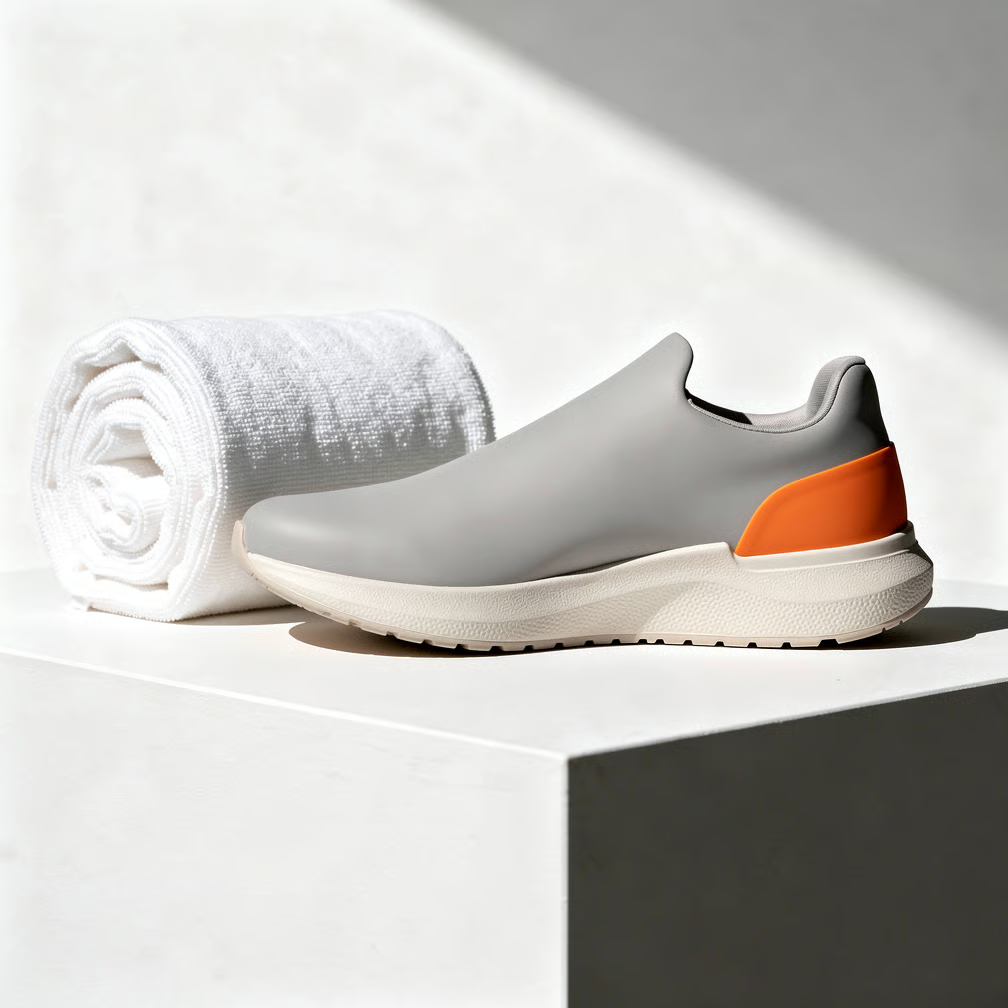
WHAT WE MADE
Identity, kit graphics, retail fit-out, launch film.
PROJECT 02 / NORTHBANK
IDENTITY, PRODUCT UI, DATA LANGUAGE / 2025
A bank that behaves like an instrument
Northbank is a business bank for people who read the numbers themselves. Nothing in the system shouts. The palette is cold on purpose, the type is small on purpose, and every screen sits on a four column grid that never bends.
1
Identity system
Wordmark, grid, motion rules
2
Product UI kit
Components, states, dark mode
3
Data language
Chart set and table styles
4
Launch site
Art direction and build
PROJECT 03 / MARROW & CO
IDENTITY, MENU SYSTEM, PACKAGING / 2024
The menu is the identity
Marrow is a twelve table room in Alfama with one sitting a night and a menu that changes when the market does.
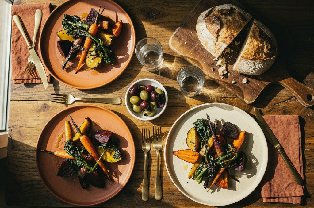
So we stopped designing a logo and designed a printing method instead. The kitchen sets the menu each afternoon on a letterpress in the back room. Everything else, from the packaging to the sign above the door, was built to sit under that one warm plate of ink.

MARKET STILL LIFE
Photography direction, Alfama
TAP FOR DETAIL
Nothing in the system needs a designer to change it.
WHAT WE MADE
Letterpress menu system, packaging, signage, wine labels.
PROJECT 04 / OSSA
ART DIRECTION, LOOKBOOK, RETAIL / 2025
O S S A
A house that shows one thing at a time
Ossa makes eight pieces a year. The brief was to stop the website behaving like a shop. We took almost everything off the page, set the type at the scale of a wall label, and let each piece hold the screen on its own for as long as the reader wants it there.
LOOKBOOK SPREAD 03
Composition study, autumn release
TAP FOR DETAIL
ART DIRECTION / LOOKBOOK / RETAIL WINDOWS / TYPE COMMISSION
CAPABILITIES
What we actually do
Five teams, one studio floor. Most projects use two or three of these.
1
Brand systems
Positioning, naming, identity, guidelines
2
Campaign
Concept, art direction, production
3
Packaging and print
Structure, artwork, print management
4
Digital
Sites, product UI, design systems
5
Motion and film
Direction, edit, sound
WHERE WE ARE
Rua da Bica 12, Lisbon. And wherever the work is.
TAKING BRIEFS FOR
Spring next year, two slots left.
NOW / SUPERBLOOM
NOW / VOLT ATHLETIC
NOW / NORTHBANK
NOW / MARROW & CO
NOW / OSSA
SUPERBLOOM STUDIO • LISBON • BRAND SYSTEMS • CAMPAIGN • PACKAGING AND PRINT • DIGITAL • MOTION AND FILM • TAKING BRIEFS FOR SPRING •
SUPERBLOOM STUDIO • LISBON • BRAND SYSTEMS • CAMPAIGN • PACKAGING AND PRINT • DIGITAL • MOTION AND FILM • TAKING BRIEFS FOR SPRING •